Create a hierarchy for decisions, not just data
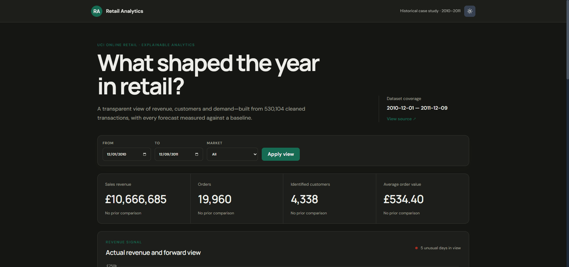
The experience brings high-level KPIs forward first, then lets people narrow the picture with filters and move into charts and anomaly signals when a number needs explanation.
Case study / Live
An exploratory retail analytics product that turns a large dataset into a dashboard for scanning performance, filtering the view, and investigating change over time.
Problem
Retail data can be comprehensive without being immediately useful. The challenge was to make patterns, anomalies, and a near-term forecast legible without overwhelming the person using the dashboard.
Constraints
Responsibilities
Architecture
A React client renders dashboard, filter, and chart views against an Express API. MongoDB stores the retail dataset that powers KPI and exploration views. Forecasting outputs are presented alongside historical performance in the same interface system.
What shaped the build
The experience brings high-level KPIs forward first, then lets people narrow the picture with filters and move into charts and anomaly signals when a number needs explanation.
The React interface is structured as reusable dashboard, filter, and KPI components so the product can support different questions without becoming a collection of one-off screens.
An Express API and MongoDB-backed retail dataset support the dashboard, while forecasting views add a forward-looking 30-day revenue perspective alongside historical performance.
Difficult technical challenge
The hard part was not adding more charts—it was deciding what to withhold. Progressive disclosure through KPI-first layout and filters kept the denser views available without making the first screen feel like a data dump.
Result
The result is a deployed product experiment that pairs data visualization with interface judgment—making a complex retail dataset easier to explore, explain, and act on.
Retrospective
Reusable dashboard states made iteration faster than expected. Next time I would define empty, loading, and sparse-data states earlier—exploratory tools show their quality most clearly when the dataset is incomplete or filtered to almost nothing.
Selected work